For sixty years, the observant will have noticed variations and incarnations of the classic Chiang Mai University symbol of an elephant raising a flaming torch, spotted across campus. Whether it be the recognisable outline in blackened brass on the university gates, a modern interpretation symbolised on a faculty’s signage, a stamped imprint on a book or as a proud sculpture standing tall on campus, this image is ubiquitous across campus and well known by the people of Chiang Mai and beyond.
According to documents provided by the Office of the University’s Council Chiang Mai University, the university symbol has undergone numerous changes and developments over the years. The idea for a symbol was first raised in 1962, when Professor M.L. Pin Malakul, then Minister of Education and President of the Committee to Found Chiang Mai University, suggested in accordance with tradition, the creation of an official symbol. At the time, in line with the 1939 Civil Service Mark Act, Chulalongkorn, Silpakorn and Thammasat Universities had announced official symbols.
With the formation of Chiang Mai University, the nation’s first regional university, it was therefore considered of utmost importance that it was symbolised by an image which would characterise the identity of the university. Chao Nuea Newspaper published an announcement on the 17th September 1962 that the university wished the public to suggest ideas for the logo with notable submissions being of an elephant, Doi Suthep within a chakra and a circled constellation. It was an accountant at Chainarong Hotel’s suggestion of an elephant, which was ultimately selected. According to the accountant, Safe Siriphan, the elephant symbolised the forests of the north, a great financial resource which has led to the development of the region, as well as being a national symbol. Not only that, as Chiang Mai was in the Payap Circle of the Rattanakosin Kingdom, already symbolised by the elephant, this was the design deemed most appropriate for development. However, in 1963 the Chiang Mai University project was transferred from the purview of the Ministry of Education to the Office of the Education Council, temporarily halting any decision about the symbol.
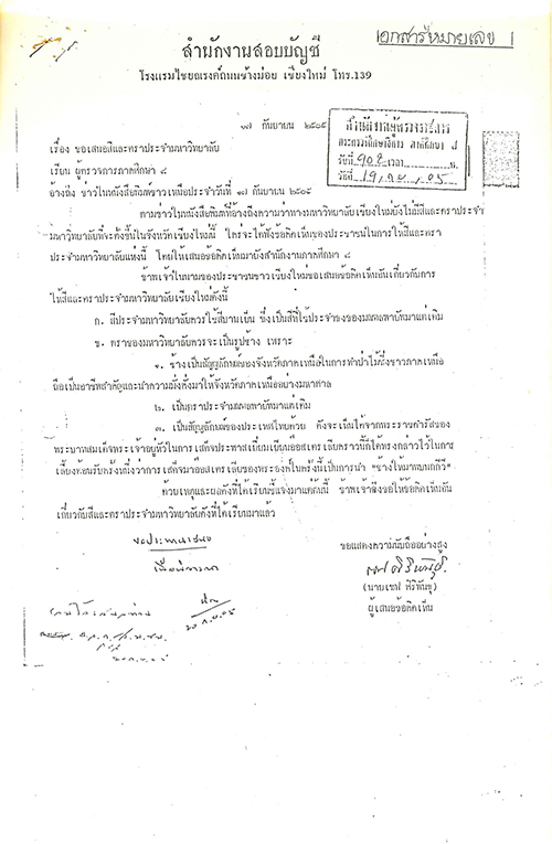
Letter from Safe Siriphan with suggestions for the university logo
Then Prime Minister Field Marshal Thanon Kittikachorn, also President of the University Council, had made a suggestion for a symbol which had been rejected, and it was therefore decided by committee to continue with the symbol of the elephant. The symbol was therefore commissioned to feature an elephant, stepping forward, holding a flaming torch high above its head. At the same time, the university motto was created: Attanam Damayanti Pandita, which translates from Pali as ‘The wise self-cultivate’. This Buddhist proverb was dedicated to the university by Somdet Phra Sangharajachao Krom Luang Vajiranayanasamvara and is inscribed in the outer ring of the university’s logo to the top of the image, ‘Chang Mai University’ inscribed in the bottom half. The two sets of lettering were separated by two images of six-petal teak flowers, yet another important representation of the North.
Records show that the university’s symbol was used in numerous printed materials in the early years of the university, such as the souvenir book gifted on the opening of the university, 24th January 1965. A blackened brass plaque, with a diameter of 1.50 m was placed at the gate to the front of the university in 1967, commissioned by then-President of University Sunthon Hongseladdawan, this image considered the classic standard of the logo until today.
Blackened brass university logo between the front gates of the university, Huay Kaew Road
The CMU 07 book, published in 1967, telling of the early years of the student body, features a line drawing of the elephant symbol, a less formal design.
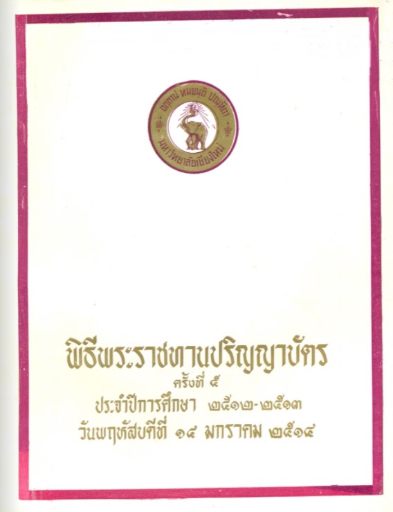
On 6th April 1968, yet another variation of the design was featured on the cover of the first graduation programme; an encircled purple elephant featuring the same Pali proverb and name of university.
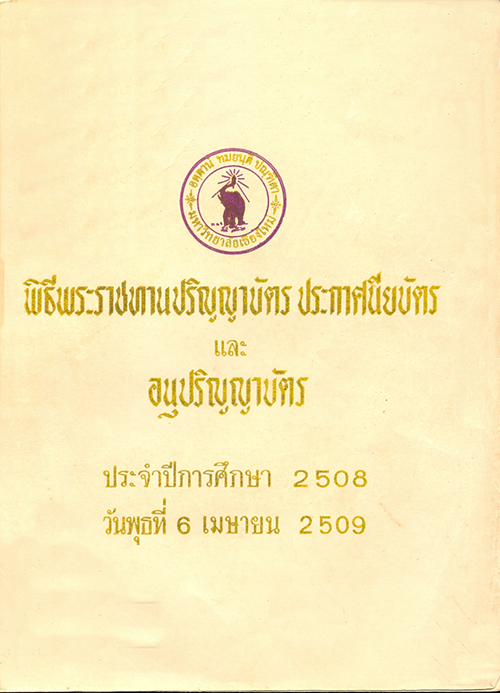
1966

1967
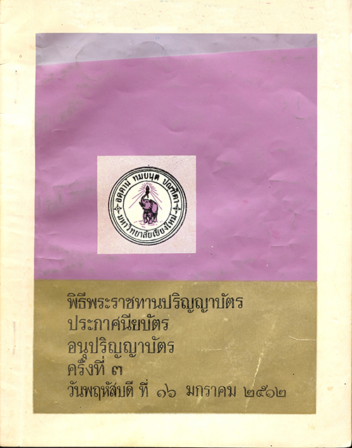
1969
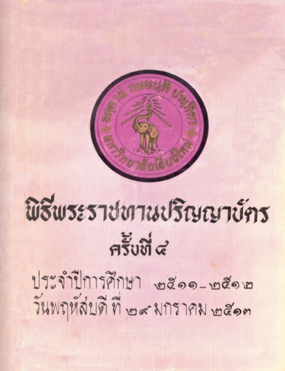
1970
1971
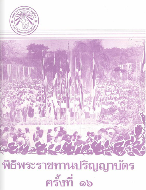
Old documents show the various progressions of the design over the years between 1966 - 1980, with occasional changes to the colour from purple to brownish gold or reemphasis of the design on the teak flower, etc. In 1981 there was a change to the design of the flame and again in 1982, when the beams from the flame were made to be more pronounced.
1981
1982

1986
However, on the 7th October 1987 it was decided, following a series of meetings with the president of the university, that there would only be one official design of the university logo and that would be based on the design on the bronze plaque at the gate of the university on Huay Kaew Road.
During the following meeting to discuss the university symbol, on 14th October 1987, Professor Dr. Kasem Watanachai, Vice President at the time, gave information to the meeting provided by Associate Professor Dr. Sit Boot-in from the Department of Philosophy and Religion, Faculty of Humanities, about the meaning behind the eight-pronged beams in the logo radiating out from the flame. According to the Associate Professor, Somdet Phra Sangharajachao Krom Luang Vajiranayanasarmvara had offered another important symbolism for the eight beams, that being its reference to the Eightfold Path, a Buddhist guide to attain wisdom and Nirvana. At the time the university was also aiming to offer eight faculties of study, in accordance with UNESCO’s guidelines for the studies of the sciences and culture.
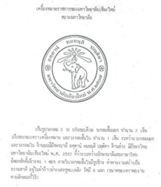
Once a consensus was achieved, the Fine Arts Department was tasked with designing a realistic looking elephant holding a flame with eight radiating beams, surrounded by double circles with the wordings Attanam Damayanti Pandita above the elephant and Chiang Mai University 1964, in Thai, underneath, separated by two six-petaled teak flowers. The elephant is depicted as stepping in a forward motion. The symbolism of the logo is three-fold:
1. The torch held aloft represents knowledge and the light which guides wisdom
and academia
2. Graduates of the Chiang Mai University are self-motivated, knowledgeable, thinkers, practical, leaders and professionals who have morality and a social conscience.
3. That the university was founded in 1964.
Photograph of elephant used as inspiration for drawing, as per submission to the Deans’ Meeting 43/30
1989 changes in design, adding the eight beams, the year the university was founded
and two six-petaled teak flowers
Professor Dr. Kasem Watanachai confirmed the official logo of the university in accordance with the Civil Service Mark Act (1939), submitting it to the Office of the Higher Education Commission on 24th July 1967. However, there was no mention of this confirmed in the Royal Gazette.
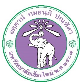
There was one final touch to be made for the logo to be completed, and that was to decide on the colour and font. Following an executive meeting on the 29th December 1993, it was determined that purple would be the official colour to be used for the elephant and the font of the logo, while the circular lines would be green. The Faculty of Fine Arts was once again tasked with completing the logo, choosing milkweed purple (dok rak) as the official colour of the university.
Logo with colors in 1993
In 2001, the Faculty of Architecture was asked to create an English language version of the logo, adding ‘Chiang Mai University 1964’ to the logo in capital letters.
Faculty of Architecture’s design with English text
Later, during the leadership of university President Professor Dr. Pongsak Angkasith, the inner circle of the logo was filled in with purple, similar to the current logo being used today.
The changes were coming to an end, and on 2nd December 2011 an official announcement was made to use the then-current logo, but with English language for Chiang Mai University 1964 instead of Thai.
Thai language

English language
Chiang Mai University logo
The Chiang Mai University logo evolved between 1962 - 2011, today being the widely recognized image known across Thailand. As the university itself grew, developed and evolved, so did its symbol; the iconic elephant slowly moving forward with its flame.
This image, for thousands, is beyond a logo. It is a symbol of love, commitment, affection and pride of each generation and class of little elephant who graduates from the university. A popular song, ‘CMU is heaven’ encompasses this special symbol; “We love as one heart…harmonious relationships…purple blood…elephant raising a determined flame…success with creative knowledge…let us forever determine to love.”